Monogram vs. Full Logo: Which Fits Your Brand?
You’ve seen both work: a single interlocking letterform on a fashion label’s zipper pull, a full wordmark stretched across a SaaS homepage. Neither is the correct choice in general, but one of them is usually correct for your specific business, and picking the wrong one is a common, avoidable mistake.
Quick Comparison
| Monogram | Full Logo | |
|---|---|---|
| Best for | Favicons, avatars, packaging, watermarks | Website header, invoices, proposals |
| Readability at small sizes | Strong, if designed for it | Weak; text turns to mush below ~40px |
| Recognition needed first | Yes, works once people know your name | No, tells a stranger your name immediately |
| Tone | Established, sometimes formal | Flexible, sets the tone itself |
| Right for a brand-new business | Only alongside a full logo, not alone | Yes, as the primary mark |
What a Monogram Solves
A monogram compresses your name or business into one or two letters, styled as a standalone mark. It solves a specific problem: representing your brand in spaces too small for a full name to read clearly, a favicon, an app icon, a watch face, a wax seal on a package. It also carries a particular tone, closer to a legacy fashion house than a scrappy startup, which fits a consultant or a service built on personal trust better than a brand trying to signal new and approachable.
What a Full Logo Solves
A full logo, whether it’s your name set in custom type or a name paired with an icon, does the opposite job: it tells a first-time visitor exactly what to call you and, often, what you do, without requiring them to already know your brand.
This matters more than it sounds like it should. A monogram only works as a business’s primary mark once people already recognize the letters. A new freelancer using only a monogram on their homepage is asking a stranger to remember two letters instead of a name, a harder ask than it needs to be this early. That pairing (full logo plus monogram) is exactly what belongs in a personal brand kit, so the two marks stay consistent instead of getting designed separately, months apart.
When a Monogram Backfires
- It’s the only mark a new business has; without an established full logo first, a monogram-only homepage reads as unfinished rather than refined
- Your initials clash with an existing brand; a quick search before you commit saves you from sharing a mark with an unrelated company
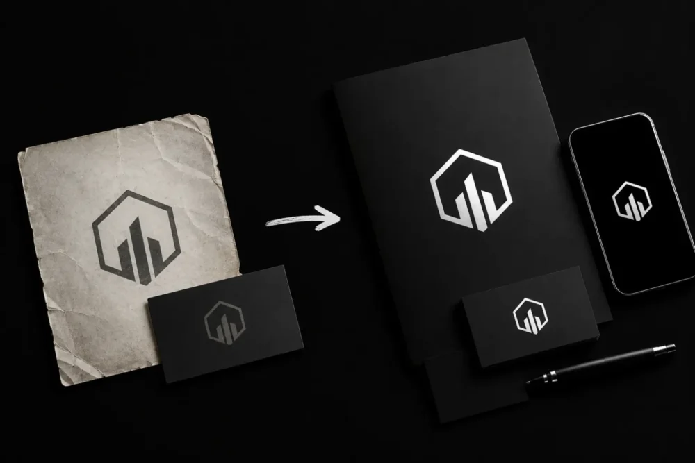
- It’s built for print but never tested online, or the reverse; fine hairline strokes that look sharp on an embossed business card can turn into a gray smudge at 32-pixel app-icon size
The pairing matters most in the places clients look closest. If you’ve built out a portfolio website separate from your LinkedIn profile, your full logo belongs in the header and your monogram belongs in the browser tab and social preview image, small, consistent, recognizable at a glance even before someone reads your name.
The Question That Decides It
Skip “which one do I like more” and ask “where does my name need to appear small.” Run through your own list: your Instagram avatar, your invoice header, the corner of a proof-of-work screenshot, a printed hang tag if you ship physical goods. Count how many of those spaces force your name below a comfortable reading size. Two or fewer, and a simplified wordmark probably covers it. Three or more, and a dedicated monogram earns its place in your kit.
Getting the Pairing Right
A logo generator can produce a passable full wordmark. It rarely produces a monogram that holds up at 16 pixels, because that takes deliberate simplification a template can’t do: dropping serifs, tightening letter spacing, testing the mark in grayscale and at actual favicon size before calling it done.
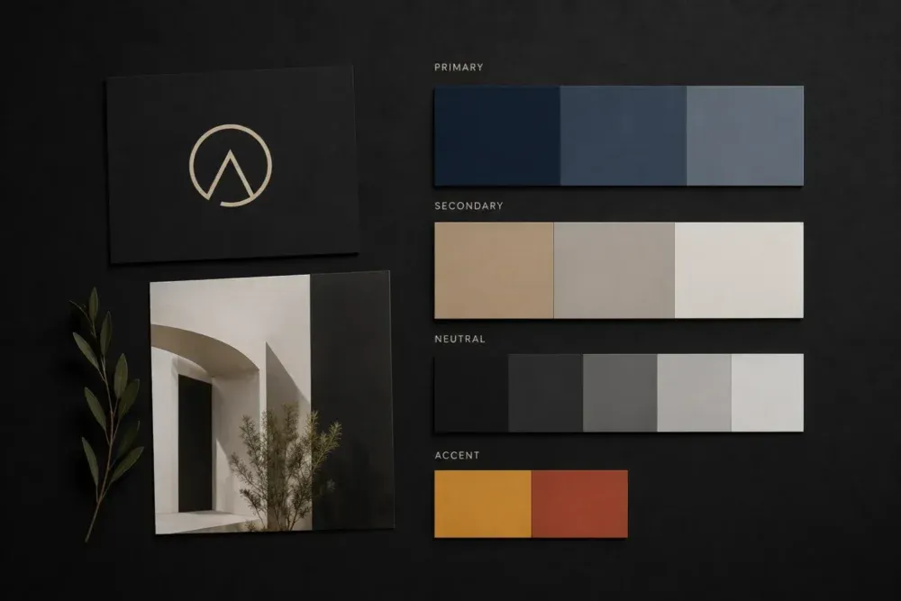
A branding and identity project designs both marks together from the start, so the monogram is a genuine simplification of the full logo rather than a separate design that happens to share a color palette. That question is also a natural one to raise in a first design consultation, before either mark gets built.
Frequently Asked Questions
Do I need both a monogram and a full logo?
Most freelancers and creators do. The full logo introduces you; the monogram represents you once people already know your name.
Can a monogram be my only logo?
Only once your name is already recognized. For a new business, a monogram-only homepage asks visitors to remember letters instead of learning your name.
What makes a monogram fail at small sizes?
Fine detail, thin strokes, or letters set too close together. A monogram needs to be tested at the smallest size it will ever appear, not only at full scale.
How much does it cost to add a monogram to an existing logo?
It depends on how the original logo was built. A simplified version of an existing wordmark costs less than designing a monogram from scratch alongside a full rebrand.
Should a monogram use the same colors as my full logo?
Yes, in almost every case. A monogram is a simplification of your existing mark, not a separate design, so the same palette and typography style should carry over.
Two Marks, One Job Each
A monogram and a full logo solve different problems: one represents you at a readable size, the other represents you in the smallest spaces your brand shows up. Most personal brands need both, designed together, not a choice made once and never revisited.
If you’re ready to get both built properly, get in touch and I’ll walk you through what a branding project would look like for your business.
Categories:
Last update: