How to Choose Brand Colors for Your Business
Pick a color because you like it, and you get a color that says nothing about your business. Pick a color because a competitor uses it, and customers can’t tell the two of you apart. Brand color choice works best as a decision, not a preference, built around what you’re selling and who you’re selling it to.
What Brand Colors Do
Color sets an impression before a visitor reads a single word. A blue-heavy palette reads as stable and trustworthy, which is why banks and healthcare brands lean on it constantly. A bold orange or red reads as energetic and urgent, common in retail and food. None of this is a strict rule, but ignoring the association means fighting an uphill battle to build the impression you want.
Step 1: Look at What Your Competitors Are Using
Pull up five direct competitors and note their primary colors. If everyone in your space uses the same blue, that’s either an industry convention worth following or an opening to stand out by going a different direction. Either way, you want to make that choice on purpose, not discover it by accident after launch.
Step 2: Pick One Dominant Color, Not Five
A brand palette built around five favorite colors ends up looking indecisive. Pick one color to carry most of the visual weight: your logo, your primary buttons, your headers. Everything else supports that choice instead of competing with it.
Step 3: Build a Palette, Not a Single Color
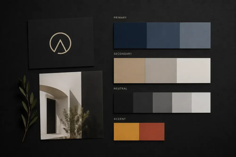
A working brand palette needs more than one hue to function across a real website and real materials:
- Primary color: the main brand color, used for logos, headers, and key buttons.
- Secondary color: a complementary color for accents, icons, and supporting elements.
- Neutral tones: grays, off-whites, or blacks that carry most of the actual page content.
- An accent color: reserved for calls to action, so buttons and links stand out from everything around them.
This is the piece a single logo color choice skips entirely. Color is one part of a full brand identity system, alongside typography and imagery. This breakdown of brand identity versus logo covers where color fits into that larger picture.
Step 4: Check Contrast and Accessibility
Text needs to stay readable against your background colors. Run your palette through a contrast checker before you commit: light gray text on a white background might look elegant on your screen and be unreadable for a meaningful share of visitors, including anyone with low vision. Accessible contrast isn’t a nice extra. It affects whether people can read your site at all.
Step 5: Test Across Every Medium
A color that looks right on a bright monitor can shift on a phone screen, print differently on a business card, and look different again embroidered on a shirt. Test your palette across the mediums your business uses before locking it in, not only on the screen where you designed it.
Common Mistakes When Choosing Brand Colors
- Picking a personal favorite over a strategic fit. Your favorite color and the color that fits your business aren’t always the same one.
- Copying a competitor’s palette closely. Similar colors make it harder for customers to tell brands apart, which works against you, not for you.
- Skipping the neutral tones. A palette with no supporting grays or off-whites has nowhere for body text and backgrounds to live comfortably.
- Never testing print or low-light versions. A palette that only gets checked on one screen tends to surprise you the first time it’s printed or viewed elsewhere.
When to Revisit Your Brand Colors
A color palette chosen years ago for a different version of your business doesn’t automatically fit the one you run now. If your positioning has shifted or your materials feel inconsistent, this list of signs your brand identity needs a refresh covers the broader signals worth checking alongside color specifically.
Frequently Asked Questions
How many colors should a brand palette have?
Most working palettes use four to six colors total: one primary, one or two secondary, a couple of neutrals, and an accent. More than that tends to dilute the primary color’s impact.
Does color psychology matter for branding?
General associations (blue for trust, red for urgency) are strong enough to work with, though industry context and your specific audience matter more than any universal rule. Test your choice against your actual competitors and customers, not a generic color chart.
Can I choose brand colors myself without a designer?
You can, especially for an early-stage business. A designer adds value by checking contrast, testing across mediums, and building the color into a full identity system rather than a single locked-in hex code.
Should my brand colors match my logo exactly?
Your logo colors should anchor the palette, but the full brand palette extends beyond the logo to cover backgrounds, text, and accents the logo alone doesn’t need to handle.
Building a Palette That Works for Your Business
Brand colors work best when they’re chosen against your competitors, your audience, and the mediums your business shows up in, not picked from personal preference alone. Get the palette right once and it carries your business across a website, a storefront, and everything printed in between.
If you want a color palette built as part of a full identity system, take a look at my branding and visual identity services, browse recent branding projects, or get in touch to start the conversation.
Categories:
Last update: