
Web Accessibility Basics: A Plain-English Guide
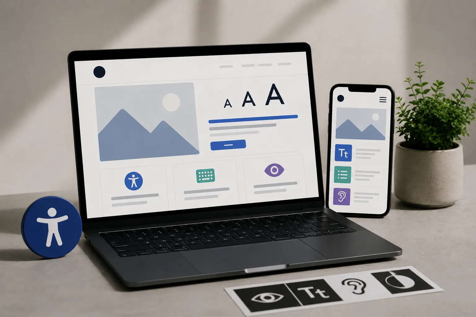

Low-contrast gray text on a white background. A photo with no description for someone using a screen reader. A menu that only opens with a mouse, not a keyboard. None of these look like accessibility problems to most business owners, they look like normal design choices. To a visitor with low vision, a motor impairment, or a screen reader open, each one is a wall between them and your business.
What Web Accessibility Covers
Accessibility means building a site that people with disabilities, visual, motor, auditory, or cognitive, can use fully, not only view. That covers a wide range of practical details: text that reads clearly against its background, images with written descriptions, a site that works with a keyboard alone, and video content with captions available.
Who This Affects
Accessibility isn’t a narrow concern for a small group. It covers visitors with permanent conditions like blindness or motor impairments, temporary situations like a broken arm or eye strain, and everyday context like someone browsing in bright sunlight where low-contrast text becomes hard to read for anyone. Building for accessibility improves the experience for a wider range of visitors than the term usually suggests.
The Basics That Cover Most of the Impact
- Color contrast. Text needs enough contrast against its background to read clearly, not only look stylish. Light gray on white fails this test for a meaningful share of visitors.
- Alt text on images. A short written description lets a screen reader tell a visitor what an image shows, instead of skipping it entirely.
- Keyboard navigation. A visitor who can’t use a mouse should still be able to reach every link, button, and form field using a keyboard alone.
- Clear, descriptive links. “Click here” tells a screen reader user nothing about where a link goes. “View our pricing page” does.
- Readable font sizes. Text that’s too small forces zooming, which breaks the layout on many sites and frustrates visitors with low vision.
Why This Overlaps With Mobile-Friendly Design
Many accessibility fixes double as usability fixes for everyone. Larger tap targets help a visitor with limited motor control and a shopper trying to check out on a bumpy bus ride. This mobile-friendly design checklist covers several of the same fixes from a different angle, since mobile usability and accessibility overlap more than most owners expect.
Where Accessibility Fits Into a Website Build
Accessibility works best when it’s part of the design and testing process from the start, not an afterthought bolted on before launch. This walkthrough of the website design process covers where these checks belong, alongside mobile testing and general quality assurance, before a site goes live.
Common Accessibility Mistakes on Small Business Sites
- Relying on color alone to convey information. “Required fields are in red” fails for a visitor who can’t distinguish that color. Add a label or symbol alongside the color.
- Auto-playing video or audio with no way to pause it. This disorients visitors using screen readers and disrupts anyone browsing in a quiet setting.
- Forms with no visible labels. A placeholder that disappears once someone starts typing leaves no reference for what the field was asking for.
- PDFs with no accessible structure. A scanned document with no readable text layer is invisible to a screen reader entirely.
Frequently Asked Questions
Is web accessibility legally required for small businesses?
Requirements vary by location and business type, and legal exposure has increased in recent years for businesses with an online presence. Beyond the legal question, accessibility affects a real share of potential customers regardless of what’s required.
How much does it cost to make a website accessible?
Building accessibility in from the start costs little beyond normal design and development time. Retrofitting an existing site costs more, since fixes like color contrast and alt text often need to be added page by page after the fact.
What’s the easiest accessibility fix to start with?
Color contrast and alt text on images. Both are checkable without specialized tools and cover a meaningful share of common accessibility problems on small business sites.
Do accessibility fixes affect SEO?
Often positively. Alt text, clear link labels, and logical page structure all support both accessibility and search engine understanding of your content, so the two goals reinforce each other more than they compete.
Building for Every Visitor, Not Only Most of Them
Accessibility is a set of practical design choices, contrast, labels, keyboard access, not a checkbox reserved for large companies with compliance departments. Those choices determine whether a real share of your visitors can use your site at all, and getting the basics right widens who your business can reach. This is one term worth understanding among several that shape how a site functions. This plain-English glossary of design terms covers the rest.
If your site needs an accessibility review, take a look at my web design services, or get in touch for a straightforward read on where your site stands.
Let's Talk About Your Project
Fill out the form with a few details about your project, and I'll get back to you with the next steps.