
White Space in Design: Why Empty Space Works
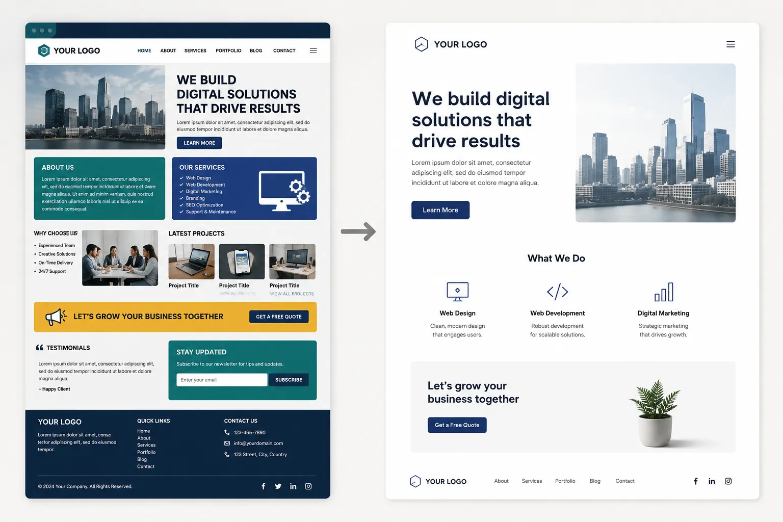

A business owner looks at a spacious layout with room to breathe and asks why so much of the page is “wasted.” The instinct makes sense: empty space feels like a missed opportunity to fit in one more feature, one more testimonial, one more call to action. That instinct is usually wrong, and the pages that follow it tend to convert worse, not better.
What White Space Actually Does
White space is the empty area around and between elements on a page, and despite the name, it doesn’t have to be white. Its job is to give the eye somewhere to rest and to separate one idea from the next clearly enough that a visitor doesn’t have to work to tell them apart. Remove it, and every element competes for attention at once, which usually means nothing wins.
Cramming a Page Backfires More Often Than It Helps
The logic behind a crowded page seems sound: more content means more chances to convince a visitor. In practice, a page with no breathing room reads as cluttered and hard to scan, and a visitor who can’t quickly find what matters tends to leave rather than dig through the noise. Space isn’t the enemy of conversion. Confusion is, and cramming a page is one of the fastest ways to create it.
Where White Space Does the Most Work
- Around your call to action. A button surrounded by empty space draws the eye directly to it. The same button buried between three other elements gets lost in the crowd.
- Between sections. Clear separation tells a visitor where one idea ends and the next begins, without needing a heavy divider line to do the same job.
- Around body text. Generous margins and line spacing make paragraphs easier to read, especially on a phone screen where cramped text feels dense fast.
- Around your logo and headline. Space signals importance. A cramped logo reads as an afterthought; a logo with room around it reads as a deliberate choice.
White Space and Perceived Quality
Visitors associate generous white space with premium, established brands, and dense, cramped layouts with lower-cost or less established ones, whether or not that association reflects reality. This is part of what a first impression is built on, and it happens fast, before a visitor consciously registers spacing at all.
How White Space Fits Into a Website Build
Spacing decisions happen during layout and design, not as a final polish pass at the end. This walkthrough of the website design process covers where structural choices like this fit into a build, alongside the sitemap and wireframe stages that set up the space a page has to work with.
White Space Behaves Differently in Print and Digital
Screen and print handle space differently: a web page can scroll to accommodate room, while a printed piece has a fixed size that forces harder tradeoffs about what stays and what gets cut. This comparison of print and digital design covers other differences between the two mediums, and space allocation is one of the sharpest.
Common White Space Mistakes
- Filling every empty area out of discomfort. Not every space needs an icon, a line of text, or a decorative element. Some space should stay empty on purpose.
- Inconsistent spacing across similar elements. Uneven gaps between cards, buttons, or sections read as sloppy, even if each individual choice seemed fine in isolation.
- Cutting margins to fit more content above the fold. This often backfires, since a cramped hero section reads as cluttered before a visitor sees anything else.
Frequently Asked Questions
Does white space have to be white?
No. It refers to empty space regardless of color, whether that’s white, a brand color, or a subtle background pattern. The term describes the function, giving elements room to breathe, not a specific color.
Can a page have too much white space?
Yes. Excessive empty space with too little content can feel unfinished or make a visitor scroll further than necessary to find what they need. The goal is balance, not maximum space for its own sake.
Why do premium brands use so much white space?
Generous spacing signals confidence: the content doesn’t need to shout or crowd the page to make its point. That association has built up over years of high-end brands using this approach, and it now reads as a quality signal on its own.
Is white space more important on mobile or desktop?
Both matter, but mobile has less room to work with, which makes spacing decisions higher stakes. A cramped mobile layout has fewer places to hide clutter than a wide desktop screen does.
Letting Design Breathe
Empty space makes everything else on a page easier to notice, read, and trust, not a wasted opportunity to fit more in. Cutting it usually costs more than it gains. White space is one of several design fundamentals worth understanding on purpose, not by accident. This plain-English glossary of design terms covers the rest.
If your site feels cramped and hard to scan, take a look at my web design services, or get in touch for a straightforward read on what’s crowding your pages.
Let's Talk About Your Project
Fill out the form with a few details about your project, and I'll get back to you with the next steps.